Looking for Answers?
Browse our articles to find the answers you need
UX Guidelines for back office pages
In this article we have gathered all the useful links to guidelines for UX in working with DS.
Design System Foundations
Read the full articlead full articlel
The visual foundations of the Design System are fully documented here.
- Colors
- Typography
- System Icons
- General Icons
- Spacing
- Corner Radius
- Opacity
- Shadows
- Gradients
- Grid System
- Business Manager Frame
- Grids
- Layout grid
- Vertical spacing

Icons & Illustrations
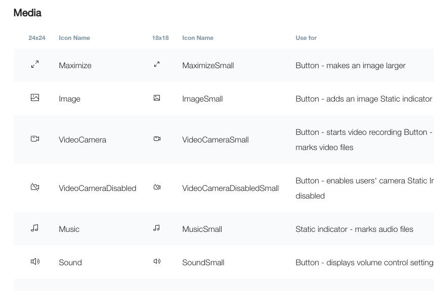
Icons & Illustrations is an important part of the back-office user experience. These graphic elements support the textual content and improve the perception of the information.
Accessibility
What is Accessibility
Accessibility for Developers
Keyboard Accessibility
Screen Reader for Developers
Defining Accessible Components
Other
Buttons
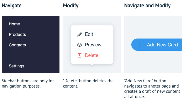
Buttons allow users to control the application which lets them achieve set goals.
It can have the intention to navigate, modify content or do both.
Modals
We use a lot of modal windows, and we use various names for it – popups, dialogs... So we pooled our knowledge and answered the most common questions in a single article for using modals at Wix.
What's a modal and how is it different from a popup?
Modal windows are called when the user intentionally opens an overlapping window to appear on top of the main content. The main content becomes disabled until the user interacts with the modal window. It’s important not to confuse it with the pop up modals.
Pop up Modals are windows that appear on top of the main content, but are not called by the user and appear unintentionally. That’s a bad experience and we avoid using popups.
Pop up Modals are windows that appear on top of the main content, but are not called by the user and appear unintentionally. That’s a bad experience and we avoid using popups.

First Time Experiences
What Is First Time Experience?
The first time user experience is when the user interacts with Wix.com, Wix Application or a Feature for the first time.
To ensure that the first time experience is smooth and well-balanced, a few things should be taken into consideration.
To ensure that the first time experience is smooth and well-balanced, a few things should be taken into consideration.
Knowing Presentation Methods
There are few options when it comes to presenting content for a first time user:
- Demo Content - a fictional/temporary content used to demonstrate the functionality of the app.
- Empty State - whole page or a section of the page stating that content doesn't exist/needs to be added.
- Marketing Layout - type of the layout designed to highlight promote selected features of an app.
Empty States
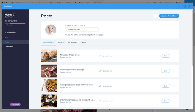
The whole page or a section of the page stating that content doesn't exist is considered as empty state. It‘s built using these blocks:
1. Illustration – visualizes state
2. Title – states what is going on
3. Subtitle – gives a suggestion what to do
4. Call to action – provides a clear action to get out of empty state
Not all the blocks are always used. Empty states can appear in very different scenarios and locations.
2. Title – states what is going on
3. Subtitle – gives a suggestion what to do
4. Call to action – provides a clear action to get out of empty state
Not all the blocks are always used. Empty states can appear in very different scenarios and locations.

Marketing Layouts
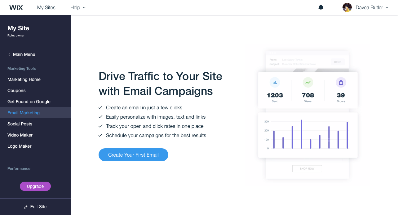
Content that is intended to promote a feature or an app can be displayed using marketing layouts. There are 3 types of them.
Marketing Page
Marketing Page
For whole page highlights, in example, first time visits, onboarding, invitation confirmations.
Saving a Page
Wix Business Manager has a lot of user generated content. Most of this content is displayed on a published website. It is important to note that all the saved changes become imediatly visible to site visitors. Therefore it is safest to use manual save pattern. The action should save the whole page, then a user feels secure by knowing that all content was updated.
There are two manual save scenarios – save and navigate; save and stay.

Tables
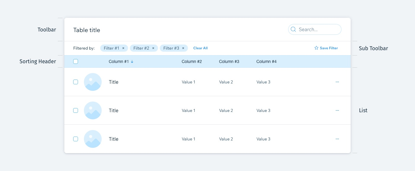
Table is a component used to display data in the structure of rows and columns. It organises information in a way that is easy to scan.
Was this article helpful?

